This case study was completed as part of my Professional Diploma in UX Design with the UX Design Institute.
For this project I was tasked with designing a new website for a fictional start up airline. The goal was to create a research-based prototype of the flight booking process that improves on industry standards.
- User Experience Researcher
- User Interface Designer

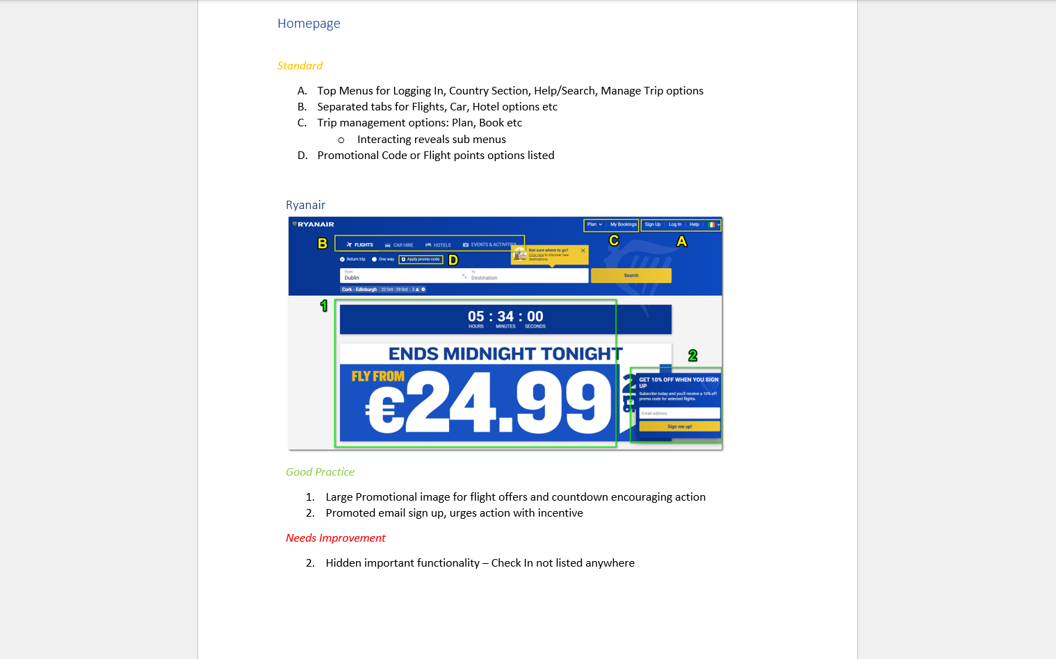
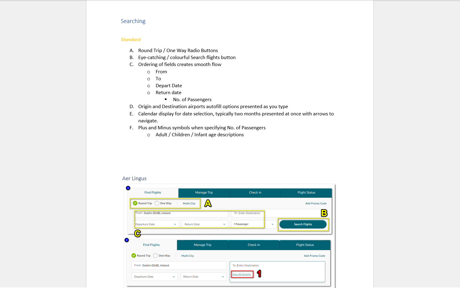
To begin, I researched other airline and flight aggregator websites. The goal of this was to identify conventions worth following as well as any pitfalls to avoid throughout the flight booking process.
Through screenshots and comments I was able to document patterns, and use these as a reference in later stages of the project.
By carrying out a survey I was able to analyse the goals of people that use airline websites, what they are trying to achieve and what is preventing them from doing so. This task also taught me how to present survey results in a way that provides the most value.
Finally, I conducted usability tests using other airline websites. Combining these with in-dept interviews I was able to validate my findings from previous research and gain new insights about users goals and behaviours.
This part of the project allowed me to develop a number of critical UX Researcher skills, including:
- Usability Test Script preparation
- Interview skills
- Notetaking
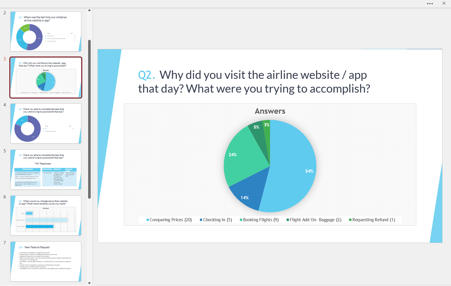
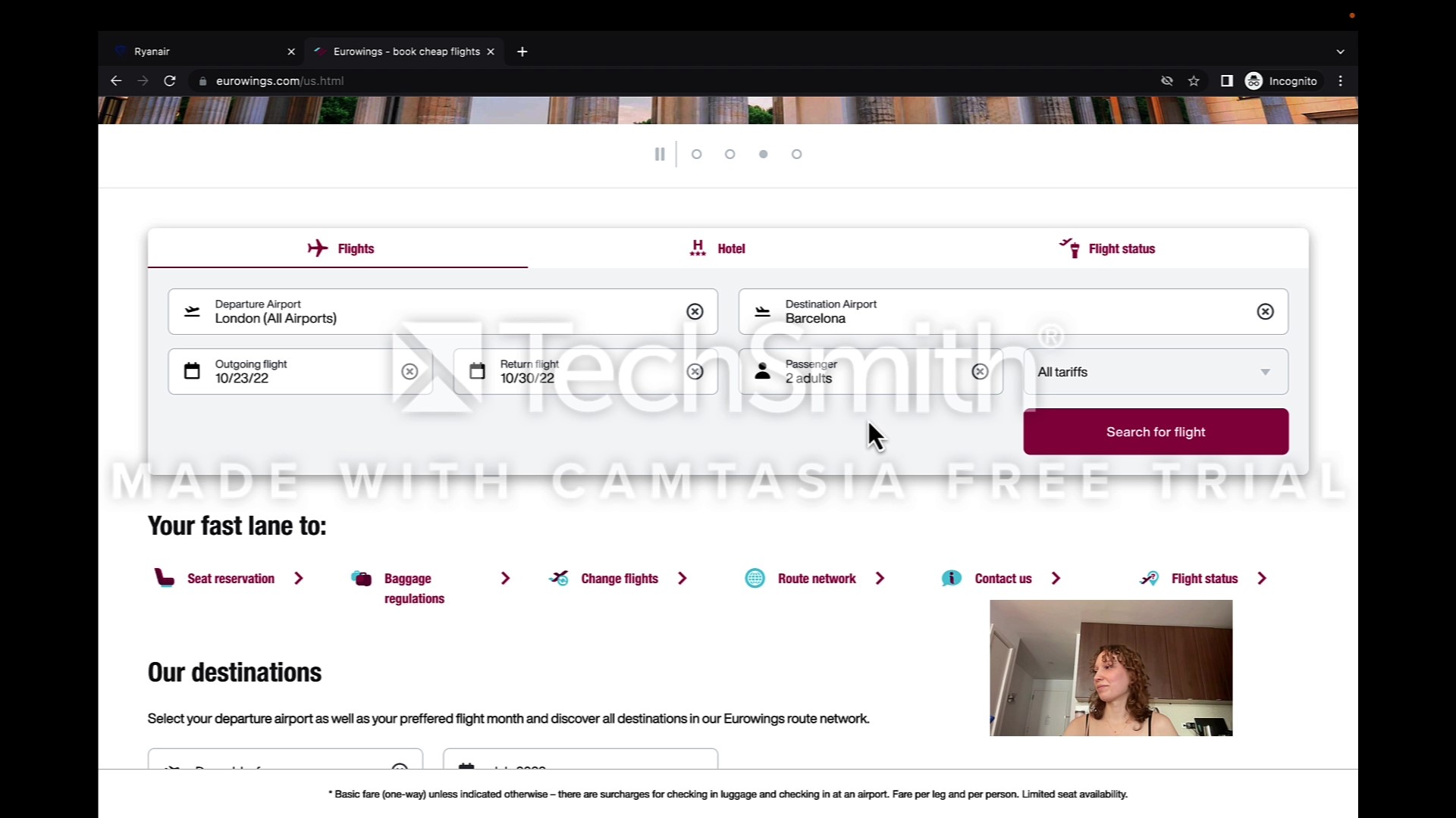
When I felt like I had gathered enough research to move onto the next stage of the project I decided on the best methods to collate my research data together and allow it to be analysed.
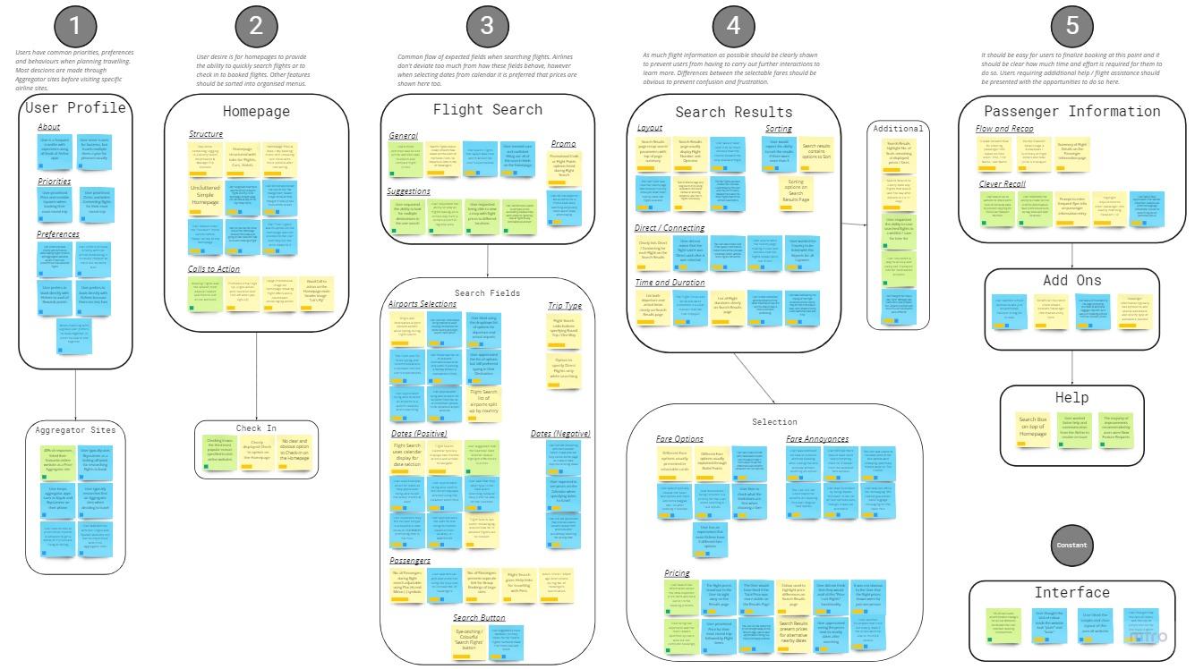
After sharing my collected data with a small group of volunteers, I facilitated an online affinity diagram session using Miro. We started by sharing individual notes and comments about all of the research findings, and later we structured these notes together into relevant groups.
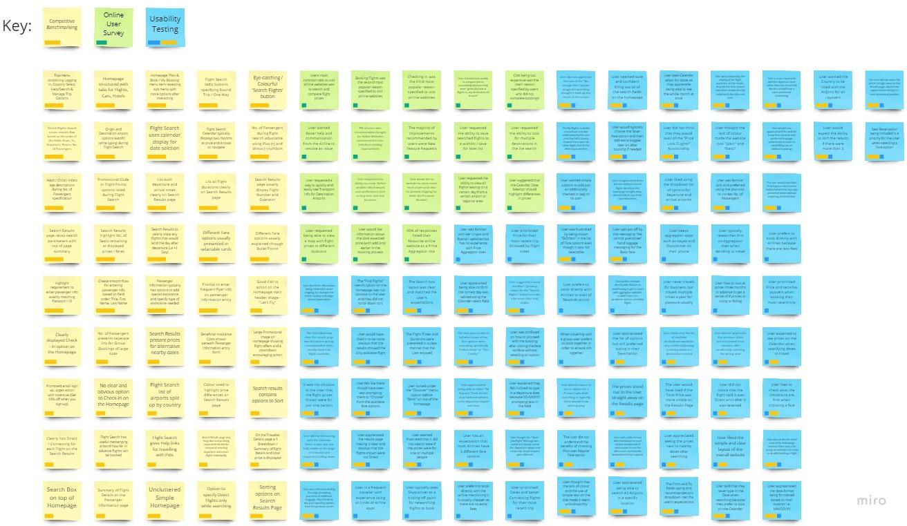
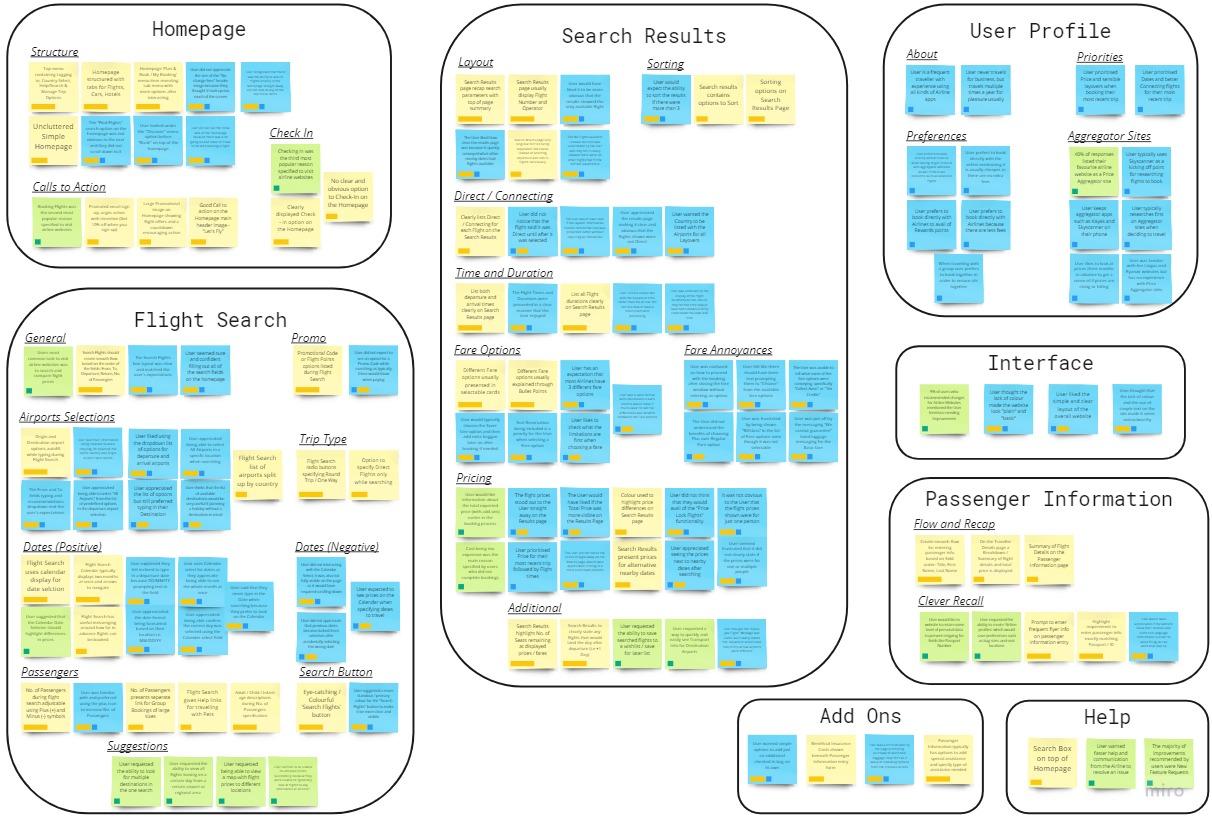
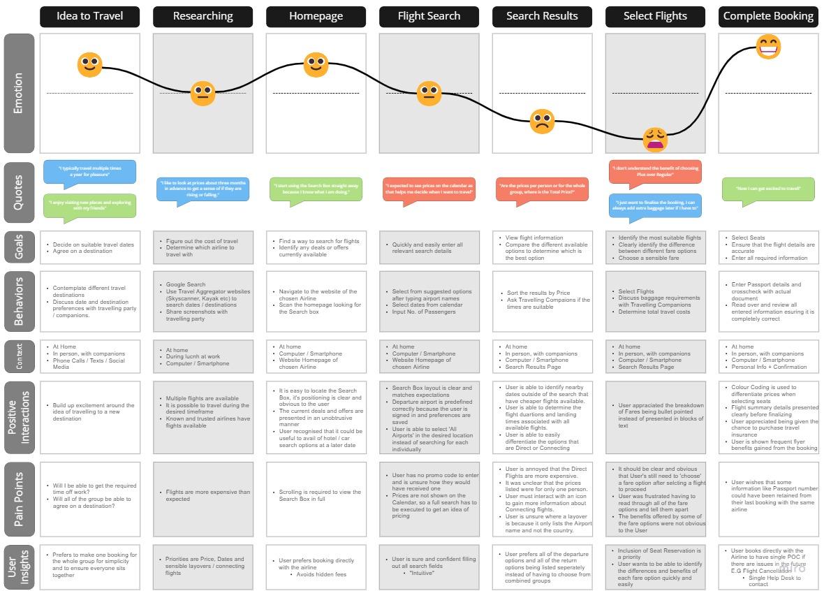
In this project I was able to further structure my research data in a way that would be beneficial to reflect on during the design stage. This involved outlining each step that a customer must go through in the process of booking a flight while also defining the positive interactions and pain points that they are likely to experience.
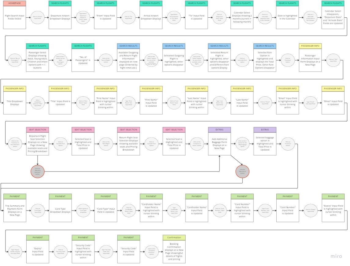
With my research analysed I was then able to begin sketching out how users would flow through my website and begin thinking about how the designs of each screen would look.
Visualising each step in the booking process proved very useful when I later began sketching out my solution. I tried to focus on a design that would show the most logical path forward in a way that was as clear and obvious as possible.

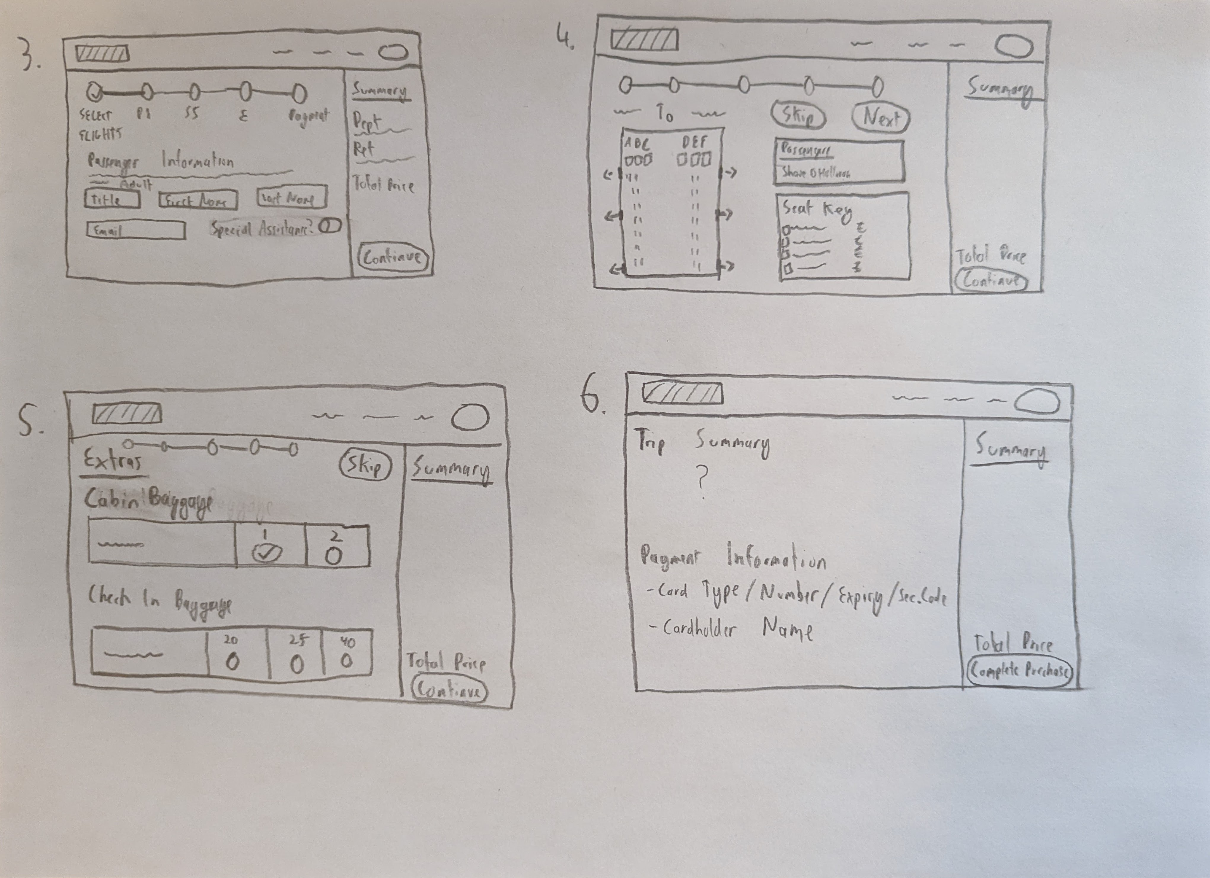
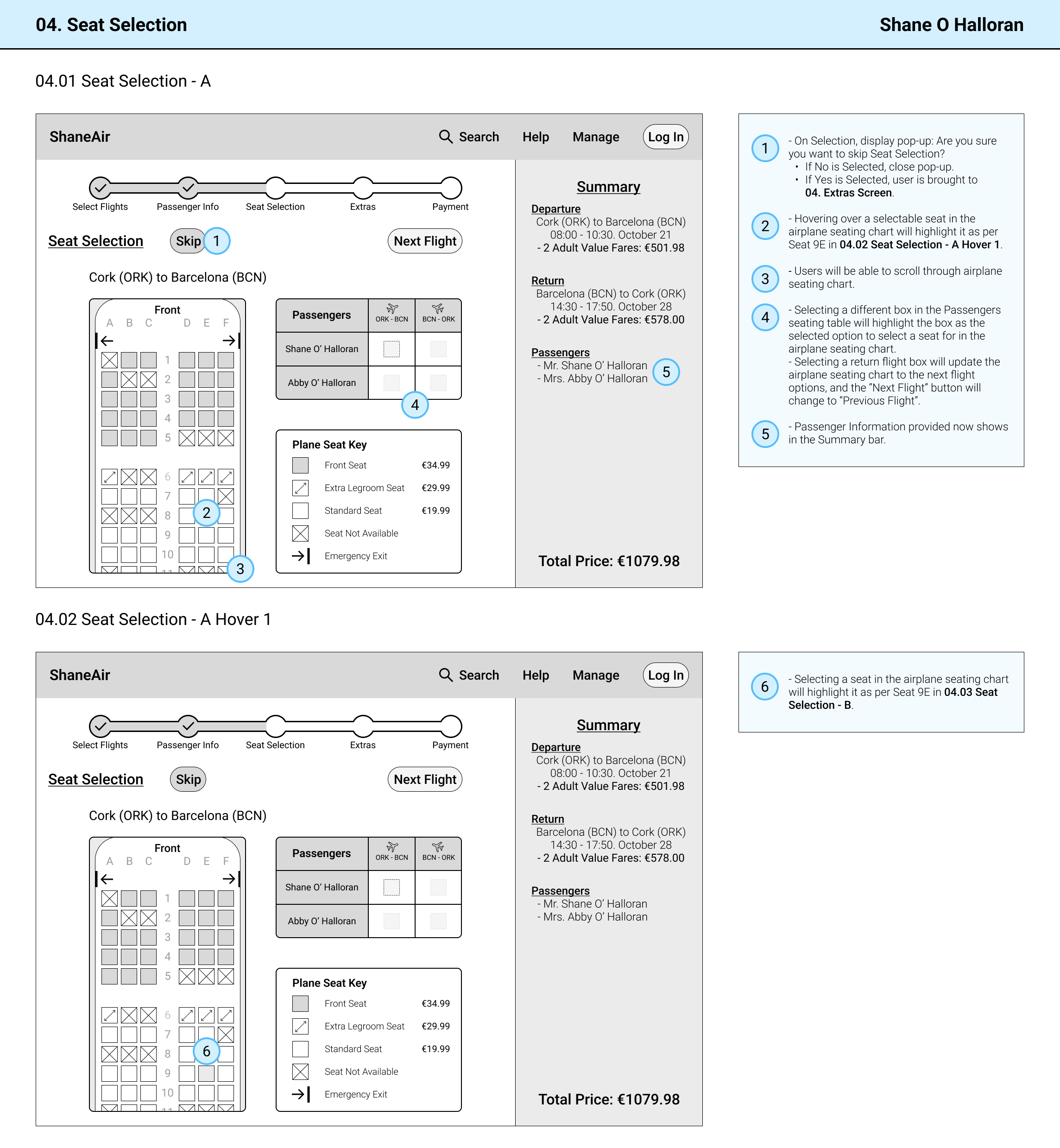
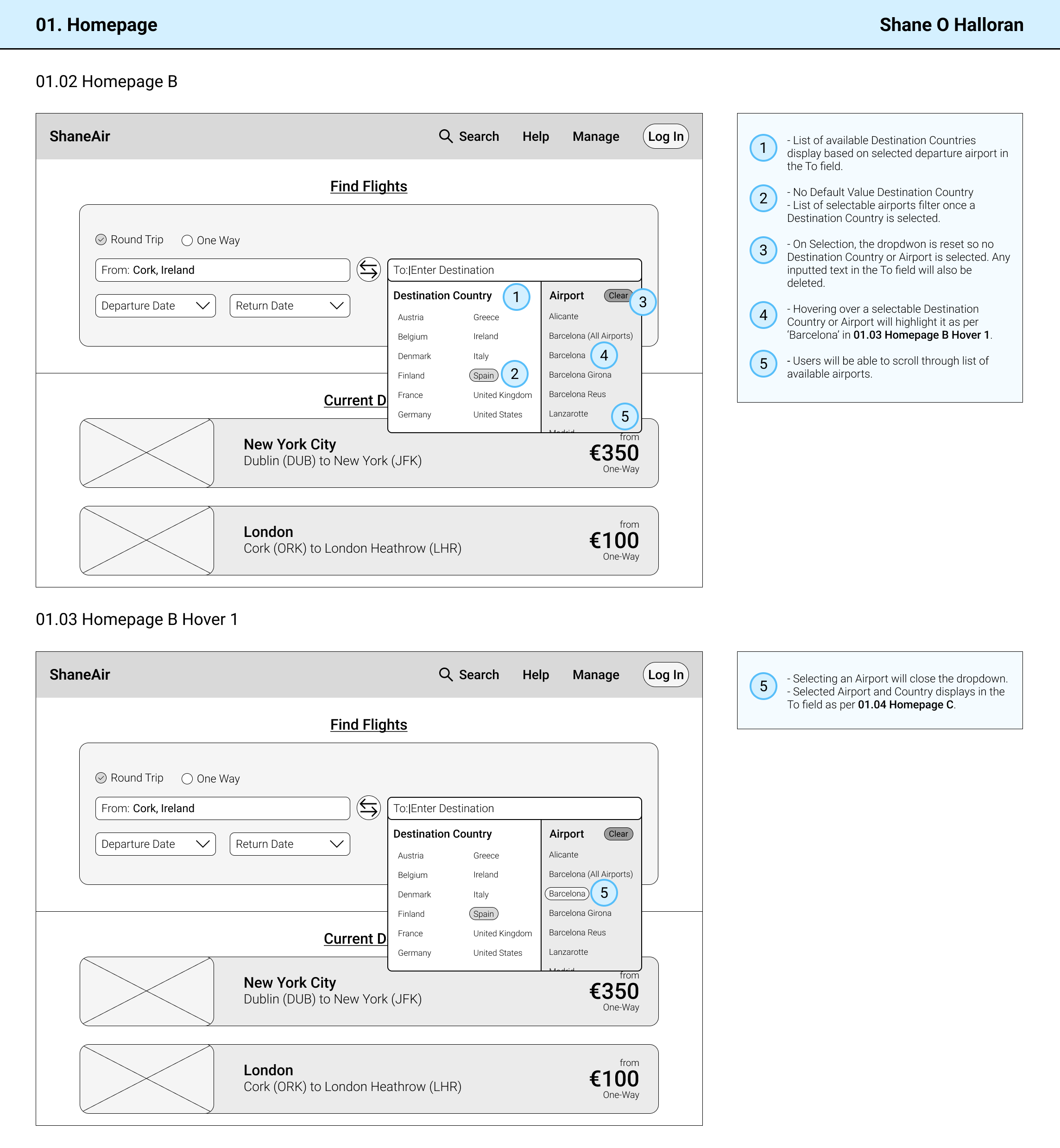
Finally I was able to start building a prototype of my website using Figma. I designed my interactive Medium Fidelity Prototype with all of the research data I collected in mind, while trying to solve the recurring issues that were highlighted throughout the process. With this in mind, I ensured that my solution:
- Made it obvious how many stages were involved in the process.
- Made it possible and convenient to skip non-mandatory stages.
- Displayed clear and accurate pricing information throughout.
- Presented fare options in a manner that was easy to understand and differentiate between.


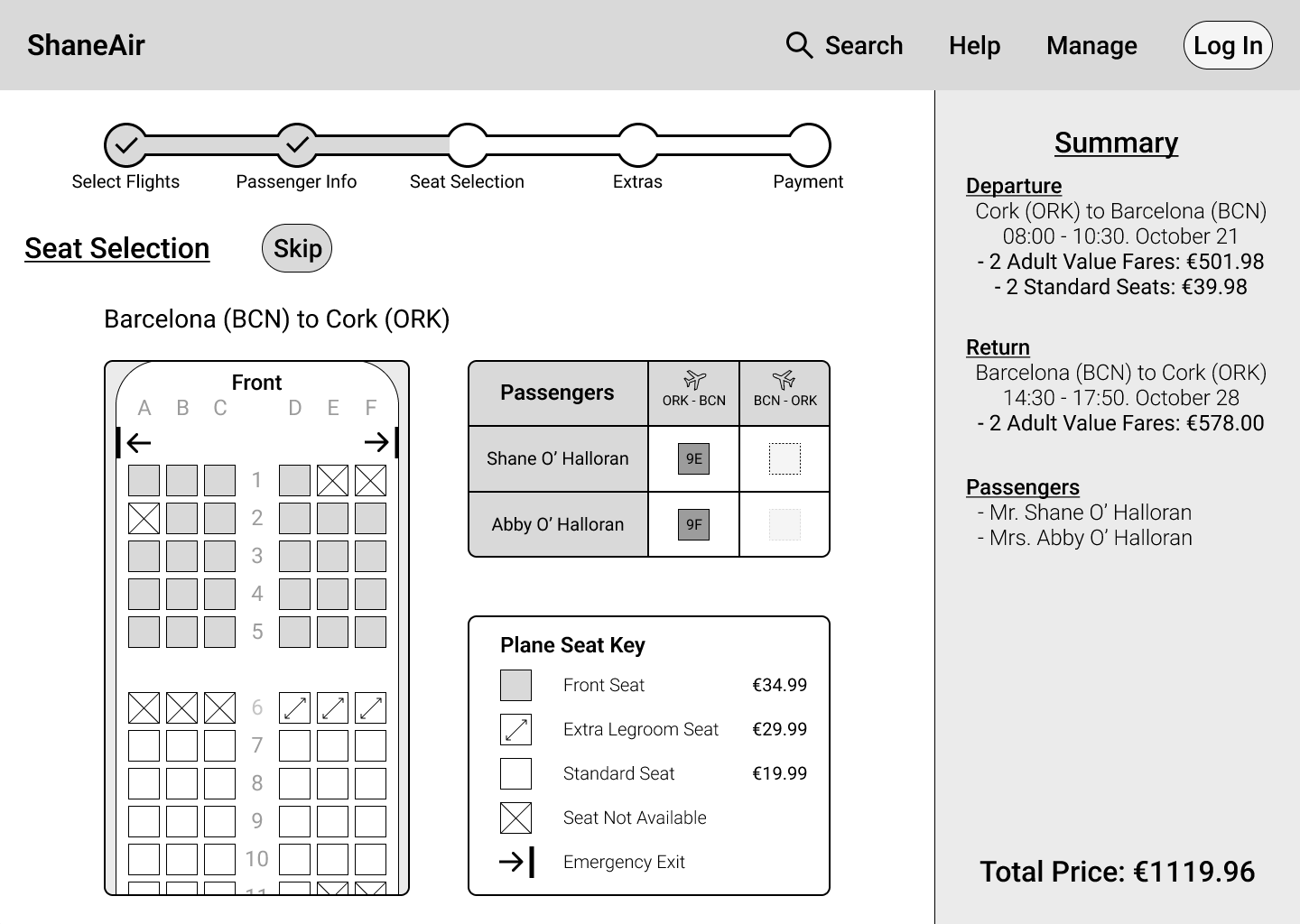
The last part of my Case Study was annotating my designs. This was an extremely important step as it allowed me to develop critical skills of a UX Designer, such as being able to prepare documentation that clearly translated my ideas. I recognise the value and necessity of this because it would ensure a smooth transition into the next stage in the event that these designs were being passed off to a developer.
